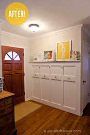
Ready for another round up of five inspirational spaces? I know I am! Today we're focusing on entryways. What I'm super excited about today's Fav Five is that all the rooms I will be featuring are actually in real homes! Sometimes I like to go outside the blogosphere to show inspiration from places like Houzz or BHG. Those rooms can be great for inspiration, but are sometimes a little unrealistic for your own home. But today, all the rooms I'm showing were make by real people, for real people. Lets dig in!
 |
| source |
I have been crushing on this entryway ever since I saw it. It is so simple yet so freaking adorable. And the best part is, this can be done in pretty much anyone's house! All you need is a wall near the front door to add this beauty to your home. And I love, love, love how they utilized that usually dead wall space that the door opens into (see how I did the same here). Everything from the board and batten with coat hooks to the colorful picture ledge comes together to make this such a happy spot. I have definitely logged this in the back of my mind for when I get a real person house someday!
 |
| source |
I have recently discovered that I am a complete groupie for a fun stenciled wall. Especially in tiny otherwise looked over spaces. By adding that fun detail, Beth turned her tiny entryway from a boring little room you had to walk through to get to the house, into an elegant and beautiful space that really makes you want to hang out in there. And that chandelier is just the perfect touch of elegance. If I were her, I may feel the need to leave the house just so I can come back in to this gorgeousness.
 |
| source |
This room was definitely one of the first things I pinned way back in the day. It just makes such a bold statement with that awesome wall (paint? wallpaper?), while calming things down with those subtle pink, feminine accents. This is definitely on my wishlist for my dream bachelorette pad. Think this one will have to stay a dream though, since I have no plans of being a bachelorette again. I guess I'll just have to enjoy staring lovingly at this space on my pinboard.
 |
| source |
I just love how Laurie was able to make such a happy space in her little entryway. She gets extra points for setting goals for this space. She knew that entryways were the first thing a guest would see when entering her home. For such small spaces, entryways carry a huge amount of responsibility. They make the first impression for the rest of your home. Laurie wanted her space to feel "comfortable, inviting and not too stuffy." Well I think she hit the nail on the head with this one, don't you? And how fun are those curtains around the door? Never seen that before, but I like it!
 |
| source |
This entryway is just stunning, in every way possible. It just feels so light and airy. I am over the moon for the closet-turned built in bench and storage. And those ah-mazing shelves! Just wow. Love how they have two different depths, so they're able to store small easy to see and grab items, and well as larger baskets to store more goodies! Crushing hard on those shelves.
So now tell me, which of those rooms were your favorite? What do you find necessary when designing your entryway? Which comes first, form or function? I like to mix a bit of both, but for such a hard working space, I have to say function takes precedence in my place.
Did you like this post? See all the posts in the Fav Five series right here!
Did you like this post? See all the posts in the Fav Five series right here!


No comments:
Post a Comment
Note: Only a member of this blog may post a comment.